Ugly Sweater Party: 1970s Mistakes and Chrome Logos
Happy Holidays!
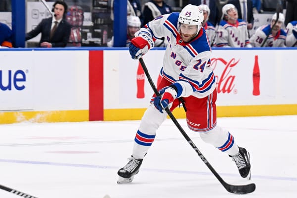
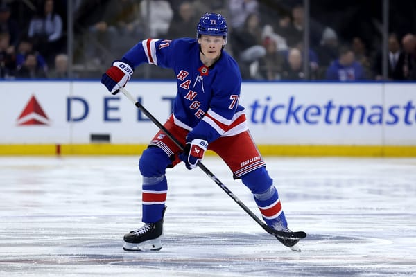
The New York Rangers sweater is a classic, whether it’s their home or away jersey. That’s why there have only been some minor tweaks to their classic design over the years. And, they’ve managed to create alternates that give a unique spin on that classic look with their Heritage jerseys.
When the Rangers have strayed from their classic look, the result has been some interesting sweaters. In particular, there are three that stand out as clear departures from what has worked for the better part of a century.
1976-1978 Jersey
The Rangers drastically changed their look for two seasons during the 1970s, when their sweater actually featured their logo instead of “RANGERS” written diagonally. But along with a change in crest, the stripe pattern and overall theme of the look also changed.
The drastic change to the sweater was a controversial one, which is why it lands on our list of ‘Ugly Sweaters.’
Some of the meaning behind the jersey change by then-general manager John Ferguson, only adds to the ugliness that is the 1970s sweater.
Liberty Jersey
Another jersey that was a major departure from the Rangers’ classic look was the Liberty alternate worn in the late 1990s and early 2000s. Whether or not it belongs on the ‘Ugly Sweater’ list is very much up for debate, since most either love this look or hate it because it’s so different from the ‘standard’ Ranger jersey.
2012 Winter Classic Jersey
The most recent departure was created for an outdoor game — the 2012 Winter Classic. As the away team, the Rangers wore white, or in this case, cream. A vintage logo highlighted the jersey accented with navy and red, and it had a fresh feeling for a retro-inspired look.
This sweater doesn’t belong anywhere near an ‘Ugly Sweater’ list, but it shows that departing from the norm isn’t always necessarily a bad thing — it’s just that it can easily too go wrong.
The Ugliest Rangers’ Sweater
We’re here, as a part of SB Nation’s Ugly Sweater series, to look at the worst jersey in Rangers’ history. One of the top two contenders is a departure from their classic look, along with their 1970s sweater that featured their logo. Again, the meaning behind that sweater makes it that much worse.
The other option, which may be the leading candidate for some, is the 2014 Stadium Series jersey.
While Winter Classic jerseys have shined over the years, the same can’t be said for Stadium Series looks. Numerous jerseys for those outdoor games have fallen flat, including the Rangers’ design in 2014. It was a massive downgrade from their last outdoor jersey.
Navy, instead of blue, is one way to give a retro vibe. It just doesn’t flow as much with white instead of cream, like it did with the 2012 Winter Classic jersey or their heritage sweater. Cream also would clash here because of the grey outlining the crest and numbers, for chrome logos — which were a problem in itself. And then there’s the navy shoulders and a wide stripe down the sides.
A combination of navy and white is a nod to the New York Yankees, as they played at their stadium for both Stadium Series games. But this is more reminiscent of a Hartford Wolf Pack jersey than anything Yankees related.
Blueshirt Banter’s Take:
Mike: I’m not a big fan of the Rangers’ Stadium Series jersey, but it pales in comparison to the affront that was the 1976-78 jersey. For years I have called this jersey, which many connect with the Phil Esposito-era Rangers, the “pajama jersey” — though that may be too kind. After all, I don’t feel the urge to pump hand sanitizer into my open eyes when I see a pair of jammies.
The decision to depart from “Rangers” and/or “New York” in diagonal letters across the front of the sweater would have been far more tolerable if the rest of the overall look didn’t feel more like a Winnipeg Jets uniform than a Rangers uniform. But it does. It feels like it was put together by someone who wanted to give the team a cleaner, more modern look.
It’s also worth noting that the 1970s jersey was the first time that the Rangers strayed from their trademark red pants since before the Great Depression. Between 1926 and 1929 the Rangers had brown hockey pants, because, well, reasons. Maybe red pants would have been seen as scandalous back in those days — kinda like how having a bare midriff and wearing leggings would cause cardiac arrests if people from pilgrim times saw them. Or maybe there was only so much red fabric to go around after the Great War. Or maybe they just couldn’t get their hands on red pants.
I’m not much of a traditionalist when it comes to hockey and sports, but it seems a bit like sacrilege to stray so far from the design of an Original Six jersey. I like to pretend that this jersey never happened. I don’t really want to talk about it anymore.
Kevin: The Rangers, more or less, have always nailed it when it comes to jerseys. Even when they strayed from the tried and true blue and white sweaters — be it with the Lady Liberty jerseys, the Heritage jersey, or the special outdoor jerseys (two Winter Classics and one Stadium Series) — the Blueshirts always look good. It’s a hard concept to screw up and it takes a true stroke of...uh...genius to mess with a working formula.
I could go into more detail on the mistake that was the 1976-78 era look for the Rangers, but I think Mike covered it perfectly above. I will point out that this look was just a Rangers specific thing, but a design that was also used by the Toronto Maple Leafs with similar appeal. It was a bad look then, it’s an even worse look now as they put a spotlight on an era for the team that didn’t see many highlights.
Tom: The Rangers are an organization that has sported a classic look for the majority of its tenure in the NHL. By that I mean the white and blue sweaters we’ve been accustomed to, and while they are certainly a great uniform that doesn’t need tinkering, I’ve been a big fan of some of the different things the team has tried over the years.
I loved the Lady Liberty jerseys, and I was glad when the team incorporated the navy into the Heritage jersey that was worn as an alternate for a number of years. I associate the Liberty jerseys with the start of Henrik Lundqvist’s career, the Jaromir Jagr era, and the world renown Marek Malik shootout snipe of the decade.
I was also a big fan of the team’s most recent Winter Classic jersey. The team’s cream sweater for the Winter Classic in Philadelphia... not so much. But in terms of uniforms that I really couldn’t stand... the Stadium Series chrome sweater was abhorrent. I get that the NHL was trying something different, but it really was just a dumb idea.
My hope is that when the Rangers implement a new third jersey, they go in a bold direction. Personally I would love a look like this, but I recognize it isn’t something that appeals to everyone.
New York Rangers Liberty Jersey concept pic.twitter.com/u4zJiuVFQQ
— Bob Kawa 🎷🛥️ (@bob_kawa) November 21, 2019
I also think this is a nice look too, as it is a blend of a lot of their recent special uniforms.
New NYR White Alternate Jersey concept. I've always really loved the simple NY shield on the Winter classic jerseys and the heather texture on a few new jerseys. pic.twitter.com/hGDCTR7mr9
— Bob Kawa 🎷🛥️ (@bob_kawa) December 11, 2019