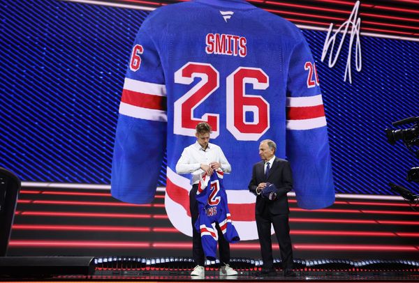
Sweater Speculation: What Could New York Rangers’ Alternate Jersey Look Like?
Every offseason, we learn more about how a team will look in the upcoming season — not just in terms of who will be skating or what system they’ll be emulating, but what they’ll be wearing.
Each year, usually between the draft and puck drop of opening night, a handful of teams unveil a new sweater — whether it’s a renovated or tweaked version of their home/away jerseys, or a new alternate all together.
Starting with the 2017-18 season, Adidas became the NHL’s uniform provider, replacing Reebok. In the first season of their partnership, Adidas and the NHL only unveiled new home and away jerseys from each team, but did not add any third jerseys besides those for outdoor games. This isn’t the first time the league went without third jerseys, as the same occurred when the league transitioned to the Reebok Edge line.
They’re here.
— NHL (@NHL) June 21, 2017
All 31 brand new @adidashockey jerseys, unveiled.#FormTheFuture pic.twitter.com/1tAKlcHRZB
A handful of teams made tweaks to their uniforms after the Adidas takeover. The Colorado Avalanche, for example, ditched their piping and opted to bring back their “mountain trim” which gives a nod to their past. The Nashville Predators simplified their Adidas uniforms by taking away the piping and having fewer stripes on the sleeves. The Minnesota Wild switched up their design as well in 2017 with changes to their stripes, and switched back to green at home. The Carolina Hurricanes also made tweaks, with black stripes on the sleeve and the warning flag in the tail stripe.
The following season, they began rolling out alternate jerseys. A number of teams went with a retro style for their thirds, including the Calgary Flames, St. Louis Blues, New Jersey Devils, Washington Capitals, and the Arizona Coyotes with their Kachina sweaters. The Anaheim Ducks gave a modern spin to their original ‘Mighty Duck’ uniforms.
A few teams brought back third jerseys from past seasons, like the Avalanche did with their “Rockies” jerseys from 2016-17. The Columbus Blue Jackets also brought back their alternates with the cannon logo. The Hurricanes and San Jose Sharks each added revamped black jerseys too with similarities to past black alternates. The Hurricanes also added a throwback sweater into their rotation with Hartford Whaler jerseys.
Others were inspired by their outdoor jerseys. The Philadelphia Flyers’ brought back their 2017 Stadium Series jersey, while the New York Islanders’ was inspired by theirs from 2014. The Ottawa Senators’ 2017 Centennial Classic jerseys became their third jerseys last year. The Pittsburgh Penguins went with a new design that was inspired by their 2017 Stadium Series look.
Some designs were for the teams’ anniversaries, like the Los Angeles Kings, who added a grey jersey with gold accents, and the Edmonton Oilers, who added a 40th anniversary patch to the royal blue uniform they brought back for their thirds.
Along with teams who were inspired by more historical looks, past outdoor jerseys, or milestones in their team’s history, a few teams, including the Tampa Bay Lightning and Winnipeg Jets, outright added a new design to their collection.
This offseason, a number of teams have already announced jersey changes and additions. The Hurricanes have a new away jersey, while the Chicago Blackhawks are bringing back their Winter Classic sweater as an alternate.
For their 50th anniversary, the Buffalo Sabres unveiled a “golden” third jersey.
Our golden jersey for The Golden Season. #Sabres50https://t.co/HEx0H3X9VU pic.twitter.com/qe3v90IAhy
— Buffalo Sabres (@BuffaloSabres) August 16, 2019
The Vancouver Canucks also have made changes for their 50th anniversary season, by dropping “Vancouver” from their home and away sweaters, adding a third jersey that is a nod to their inaugural sweaters, and bringing back the “Flying Skate” as voted on by fans.
As for the rest of the teams intending to change their look, those have yet to be made official or revealed. The Athletic’s Jesse Granger reported that the Vegas Golden Knights are expecting their third jersey to be released in October. While the Ducks added a new third last year, it’s been reported that they’re going in another direction this season with an orange alternate.
There have also been a few leaks — from the Boston Bruins adding a sweater inspired by their 2019 Winter Classic look and the Oilers going with a navy and orange design.
Other teams are expected to have third jerseys as well, including the Ottawa Senators, Florida Panthers, and Predators. The Kings, Avalanche, Predators, and Stars, who are all playing in outdoor games, are expected to have new jerseys for those occasions as well.
But what about the New York Rangers?
The Rangers originally were slated to add a new alternate jersey, but that expectation has been downgraded to just a possibility. So if not this year, then maybe they bring an alternate back into the mix next year.
Whether it’s this or next year, what could that third jersey look like?
The Rangers’ last third jersey was introduced for their 85th anniversary season. The Heritage sweaters, like the home and away uniforms, featured their name diagonally. Unlike the home and away sweaters, these said “New York” instead of “Rangers,” and were navy with cream and red, instead of blue with white and red. These jerseys were first introduced in 2010 and worn through 2017; a 90th anniversary patch was added for the 2016-17 season.
This could easily be brought back as an alternate. The navy and cream gave a vintage look to their classic sweater, and they kept their style up with a diagonal name as opposed to a logo. They were also a very classy look that didn’t try too hard, and is something you’d be fine with as a regular home jersey.
But if the Rangers preferred to keep their name on the jersey instead of New York, they could look to their uniform used for the 2018 Winter Classic.
This navy jersey was a nod to their Heritage sweaters and the inspiration came from sweaters worn in the 1930s. Instead of cream, this jersey was accented with white. The traditional “Rangers” lettering highlighted the front instead of “New York,” and stripes along the shoulders were added. This sweater also featured a logo, unlike the Heritage sweater (besides when there were anniversary patches added). The logo on the front either said “N.Y.” or had a “C” / “A” for the captain and alternates.
Big City. Bigger moment.
— adidas Hockey (@adidashockey) November 24, 2017
The Blueshirts are geared for the #WinterClassic. Rep your @NYRangers 🔜 https://t.co/9xSfoCMNIn#teamadidas pic.twitter.com/GvEyTSgtzA
As other teams have, including the Flyers and Senators, the Rangers simply could bring back their last outdoor jersey as an alternate. The hesitation may be in the gap between now and January 1, 2018. It would have made more sense a year ago, but over a year and a half later, it seems slightly delayed.
Plus, this sweater represented a different Rangers’ team; since then, the franchise has changed direction, there was a coaching change, and quite a bit of roster turnover.
Instead of bringing back the exact jersey, maybe this could used as inspiration, without it being a replica. The Rangers could blend their Heritage and Winter Classic looks together; maybe it could Heritage sweater with the addition of stripes along the shoulders, or the design could back to “Rangers” from “New York.” Another option could be simply adding cream to the 2018 Winter Classic jersey. Or, a small detail of the Winter Classic could become the star of a jersey; the logo featured in that last outdoor jersey could become the crest of the next newest uniform.
Or maybe, the Rangers should take a deeper look at what they’ve worn outdoors. And no, that doesn’t mean the Stadium Series uniforms from 2014 with chrome logos.
Rather, let’s look at their first Winter Classic jersey from 2012.
Unlike the Rangers’ Heritage, 2018 Winter Classic, and Stadium Series jerseys, their 2012 Winter Classic sweater featured a logo instead of their name diagonally. Like the last Winter Classic jersey, they likely wouldn’t go with the exact same from 2012. But this could be an intriguing option to build on.
First, they likely wouldn’t go with a cream jersey. It would probably be blue or navy to be worn at home. For a more retro look, navy is more fitting. So one option would be making this sweater in navy as a new third; the stripes could still be spaced with the main color, and the shoulders could feature cream and red instead of navy and red. The stripes could also be updated — maybe to look more like those of the 2018 Winter Classic jersey both across the shoulders and on the arms.
One more twist would be to switch the cream to white, so it could combine the last two Winter Classic jerseys together. Cream has a more classic feel than white, but maybe with a vintage logo, a way to make it more modern is to accent with white. To keep this logo, but give it the most modern feel, the navy and cream could be made blue and white. The stripes could simply look like those of the home jersey, or stripes along the shoulders could be added as well.
If the Rangers want to take inspiration from the past, but not from their outdoor history, or even their last alternate, there’s another route.
The Rangers could bring back the fan-favorite Liberty sweaters, introduced in 1996-97. The Liberty jersey took a different direction from the classic Rangers’ look by adding grey to the stripes, making the sleeves red, removing the stripes from the bottom of the jersey, and completely changing the logo.
There would be a positive response from a number of fans if this jersey was simple brought back, or at least, the logo was. The Rangers could go with a stripe pattern similar to what they have now both on the sleeves and bottom of the jersey, while featuring this logo.
Another option to explore is simply going with their logo. Since 1926, the Rangers have only had their crest instead of “Rangers” in two seasons: 1976-77 and 1977-78.
Along with adding their logo into the design, the Rangers also changed their striping pattern. The combination of the two changes gave the sweater a very different feel from what they’ve had throughout their history. So, maybe it’s worth experimenting with that crest, as well as their current striping pattern.
The logo could simply replace the “Rangers” written diagonally on the home uniform for an alternate. It wouldn’t be as drastic as a change from home to alternate as some teams see, but will still give them another look to rotate in. Or, the Rangers could feature their crest on a navy jersey. That would work with their standard home stripes or they could go for a slightly different pattern — maybe closer to the stripes on the Coyotes’ home jersey or Golden Knights’ just to give it a different look without departing too much like the uniform from the 70s.
Whichever direction the Rangers go, it’s clear they have options, and can pull inspiration from their past — from the start of their history, through 2018 — and can take notes from others around the league. Now the questions are which path they’ll take, and when it will be revealed.