Sweater Speculation: What We Think the New York Rangers’ Alternate Should Look Like
Last week, I dove into what the New York Rangers’ third jerseys could look like — outlining the changes since the Adidas takeover last season, how teams have tweaked and changed their jerseys, and what’s inspired their alternates.
Related
Sweater Speculation: What Could New York Rangers’ Alternate Jersey Look Like?
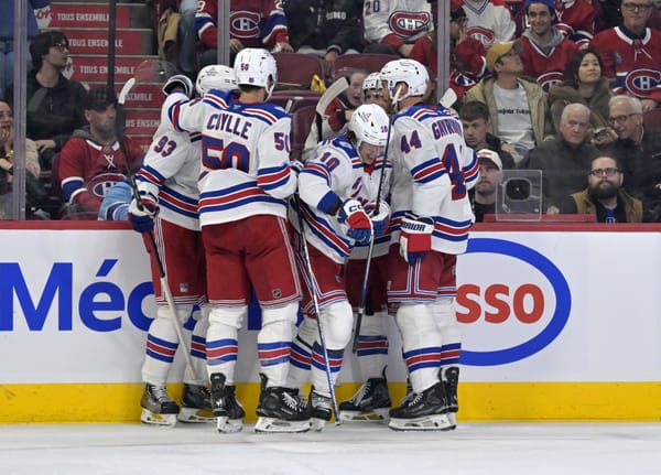
We still don’t know what the Rangers’ third sweaters will look like, what the inspiration will be, or if there will even be one for this season. But here at Blueshirt Banter, we decided to talk about what we think they should look like.
Joe: I wouldn’t hate “New York” being written in the same lettering as the “Rangers” is right now. I do love the cream jerseys akin to the Winter Classic jerseys, but even the royal blue would be nice.
Mike: I think it goes without saying that Rangers fans will revolt if red is the primary color of an alternate, so let’s go ahead and rule that out right now. In fact, let’s just get rid of the red entirely. What I would love to see is a return of the Lady Liberty crest, but to have it used with a more “throwback” design instead of the garish diagonal sleeves and silver we saw back in the late 1990s. Take the 2018 Winter Classic jersey, get rid of the stripes on the shoulders, replace it with a cream NYR crest with just “NY” in it, add some strings to the collar, and add in some brown pants and hockey gloves with cream accents. That’s right. Brown, navy, and cream. Boom.
Kevin: I really, really liked the most recent Winter Classic jerseys. While the darker cream color does add a bit of a vintage taste to things, the lighter font and accent color really pops and helps the red stand out on the navy. So if the Rangers are to bring a third jersey back, I’d say use that model as a template. Maybe update that NY shield logo they used and put that on the shoulder along with a new Lady Liberty crest.
Matt: I’m totally into bringing the 2012 Winter Classic Jersey back as the full-time third jersey, as I think that sweater was perfect. I’d also be OK with some form of the Liberty jersey, but that’s more nostalgia than anything.
Bryan: Some sort of crossover between the most recent Winter Classic jersey and the vintage Liberty jersey. The colors on the Winter Classic jersey work very well and make for a sharp looking sweater. I wouldn’t mind seeing them use the same shoulder style from the 2018 Winter Classic and mixing in the arm striping from the old Liberty jersey. As for the crest, an updated version of the 2012 Winter Classic logo to match the colors would be the perfect finishing touch.
Phil: Given the wave of “throwback” designs that have come out of this group of third jersey designs, I would love to see the Rangers resurrect the late 90s-era Liberty design but updated against the vintage look and feel of either the 2018 Winter Classic jersey base or the 2011 Heritage jersey. Either base would provide a distinct and classic foundation to offset with the sharpness of the reintroduced Liberty Head logo. If the team simply wants to reissue much of the same cutting-edge style the original Liberty jerseys were known for, however, the Liberty Head crest sewn onto the 2014 Stadium Series base — the same one that was so popular and well-received that the Hartford Wolf Pack adopted it — could be just as successful, especially if done in road whites.
Jack: I wish the Rangers had an abbreviated name without a negative connotation, because I’d really like a jersey in the mold of Tampa’s old “Bolts” alternate or Ottawa’s old “Sens” one. Aside from that, bringing back the liberty head jerseys (both the home and road variants) would be nice.
Adam: Bring back the Heritage sweater. I understand that third jerseys are planned obsolescence, but sometimes you just don’t need to mess with success. The heritage jersey is maybe the greatest third jersey in the history of hockey.
Shayna: If the Rangers are willing to bring back a sweater from the past, Adam nailed it. The Heritage sweaters are beautiful options for thirds. But if the idea isn’t to have an exact replica of years past, another option would be to use the 2012 Winter Classic jersey as inspiration.
While cream jerseys would look great on Madison Square Garden ice, they’re more likely to stick with blue or navy for their alternates. So, to bring a jersey with a crest back into the mix — which keep in mind, the Rangers have only done for two seasons and in this outdoor game — could work. Make the jersey navy, keep the spacing between the stripes, and flip the navy details on this jersey with cream. If it feels too busy, ditch the stripes on the shoulders entirely.
I don’t really see the Rangers going outside the box with a new concept or design for their thirds. I more-so see them taking a page out of the past. So, if that’s the goal, and maybe they want to do it without changing to a navy jersey, they could go all the way back to their early years for inspiration. The jerseys could be modeled after their inaugural season’s design with a slightly lighter blue jersey, a white collar, and white lettering that spells out “RANGERS.” Or, the inspiration could be the 1928-29 sweater which introduced the red lettering with white trim. It’s a way to have a vintage jersey that feels somewhat fresh since it hasn’t been seen in years.
What do you think the Rangers’ third jersey should look like?