Blueshirt Banter Contest: Voting Is Now Open!
We would like to thank everyone who participated in the Blueshirt Banter Winter Classic Jersey Contest. Today will be the official first day of voting for all of our entries. But first, here are the rules on how voting will work.
- Jerseys will be displayed after the jump along with the poll.
There will be a poll with all eight jerseys listed as options.
Voting for the first round will be open until Sunday, August 28th. - The top four jerseys with the most votes will move on into a play-off style vote. (#1 vs #4 | #2 vs #3)
- The winners from each pairing will move on into a final vote-off. The jersey with the most votes will win our contest.
Artists of the entries will remain private until the contest is over. This will help avoid the swaying of votes./
Jerseys and the poll will be displayed after the jump. Happy voting, and good luck to all of our entries!
Jersey #1:

No description included.
--------------------------------------------------------------------------------------------------------------------
Jersey #2:
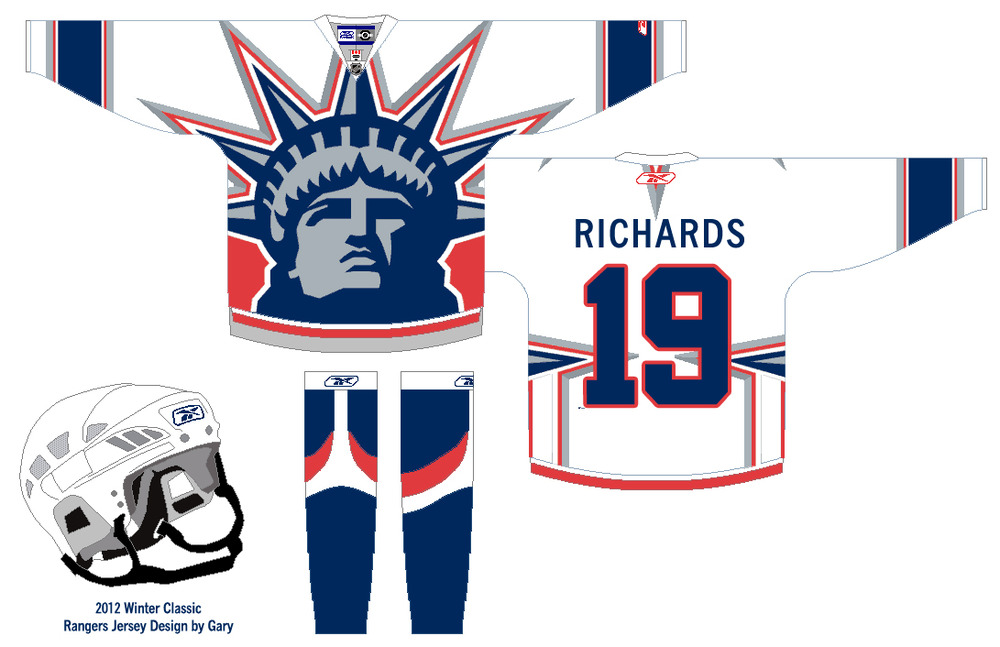
Idea just clicked in my mind when I saw the jersey template and I knew I wanted to incorporate the Statue of Liberty logo into it, so this is what I came up with.
--------------------------------------------------------------------------------------------------------------------
Jersey #3:
Here's my entry to the contest. It's an updated version of one of the designs that Eric had on his site.
--------------------------------------------------------------------------------------------------------------------
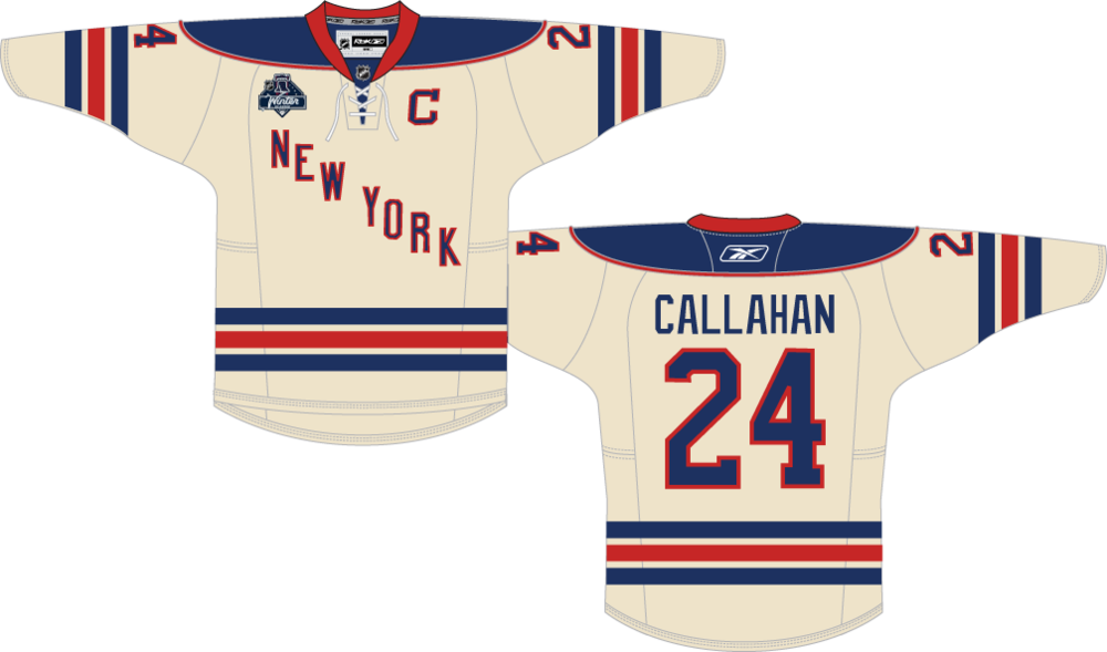
Jersey #4:

No description included.
--------------------------------------------------------------------------------------------------------------------
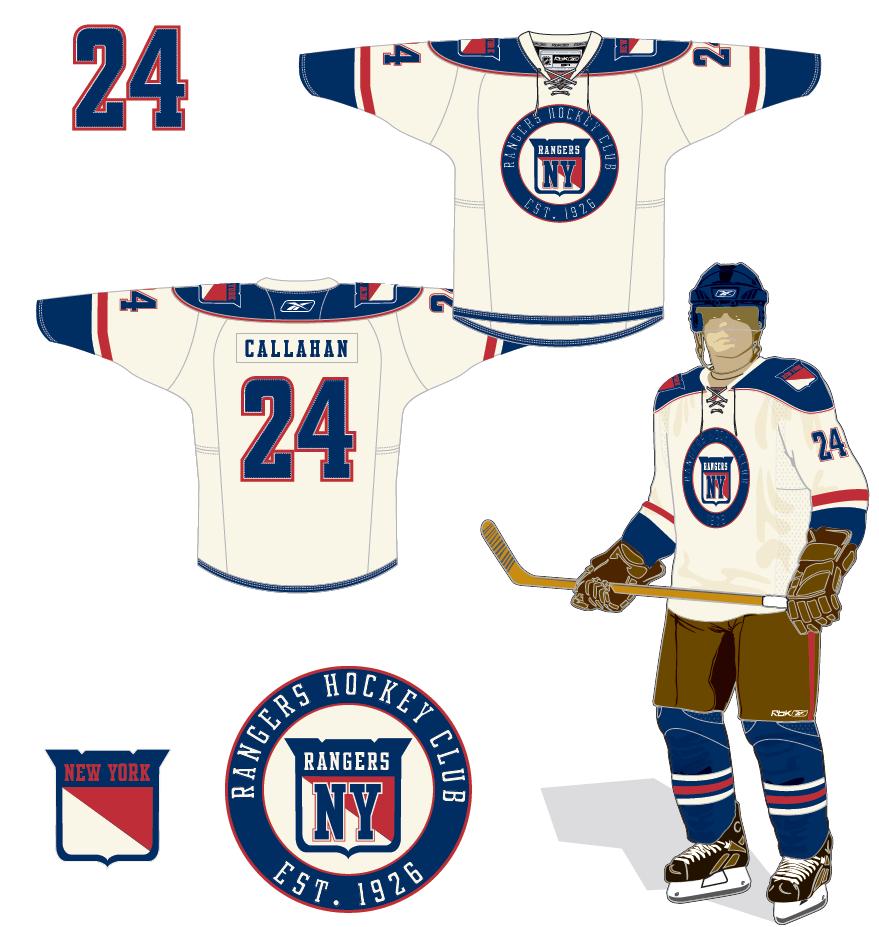
Jersey #5:

I tried to keep classic in a sense, obviously with the diagonal lettering. Seeing as how the heritage jerseys were such a success I tried to stray from a standard road white to more of a cream/tan, giving it a heritage feel. The older style crest should patch also fits in with this idea. The stitching on the numbers is a nice detail from the Sabres new 3rd's so I chose to incorporate that element as another layer of personality.
--------------------------------------------------------------------------------------------------------------------
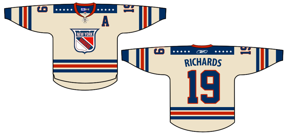
Jersey #6:
I am a daily reader of Blueshirt Banter. I hope you like them. I went with an old school look where the white is actually a light cream color to make it look aged and with logos that seemed more appropriate for the 20's and a touch of old school varsity sweater.
--------------------------------------------------------------------------------------------------------------------
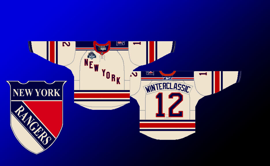
Jersey #7:
This design was inspired by the classic Ranger jerseys of the past, with a little history and national pride included.
The colors are picked from the current Rangers vintage jersey. I really like the shades they chose for that jersey and the cream color also gives the jersey a more vintage look than plain old white.
Stripes: I felt that anything that strayed from the classic blue-red-blue stripe pattern would stray from the Rangers brand so I felt it was pivotal to leave that intact for a true representation without losing our "look".
The stars "align" on this jersey for a few reasons:
Personal: I have always felt the shoulder area in the current Rangers jersey was a bit too redundant with all the other striping going on in the jersey, so I replaced the stripes with the stars. They also give the jersey a more vintage feel.
Historical: Let's also not forget the root of the name "Rangers", original team owner Tex Rickard grew up in Texas and likely named the team "Rangers" from his time spent there as a child.
National: The stars represent the stars of the USA flag and since the Winter Classic will be nationally televised I felt it would be a nice stage to present this look.
The old style logo tops the vintage look off on this jersey. Our logo is underused and improperly used when it was put to use in the past. I chose this specific logo because it has a vintage look to it being from 1947/48 - 1952/53. The older logos were a bit too dated and not refined, this logo shows some of that vintage look and it musch easier to connect to our current logo as well. The badge look of our logo is also in homage to Tex Rickard's vision.
I felt like it was important to create a throwback jersey that represented the Rangers past and also a little bit of USA pride. I feel like not an overhaul but subtle tweaks would get this job done, since we are dealing with such a storied franchise and we have also seen many failed attempts at jerseys whether throwback or new. I also wanted to add the we have a great logo and I feel it should exist on at least one of our jerseys.
--------------------------------------------------------------------------------------------------------------------
Jersey #8:
No description included.
--------------------------------------------------------------------------------------------------------------------
*** Jerseys are click-able for a larger view ***
Choose a jersey
| Jersey #1 | 2 |
| Jersey #2 | 46 |
| Jersey #3 | 137 |
| Jersey #4 | 20 |
| Jersey #5 | 95 |
| Jersey #6 | 145 |
| Jersey #7 | 121 |
| Jersey #8 | 19 |