NHL Jerseys: My Top Ten
Originally, at some point over the summer I had wanted to do a "Worst Hockey Jerseys" story, but we've hit the doldrums of the off season, and a few other sites have beat me to it. Besides, how many times do you guys really need to hear that the Vancouver Canucks "Flying V" jersey is the worst hockey jersey of all time? (Although this one is a close second)
So instead, being the positive kinda guy I am, I am going to bring you my favorite 10 hockey jerseys of all time. I've included third jerseys in this list, and they are in no particular order. So without further ado, here we go:
You can click the name of the team jersey and see a full size picture.

Montreal Canadiens Third Jersey: This was a tough one. I like all the Canadiens jerseys, but there is something about this white one that just sticks out for me. There was plenty of "les resistance" in Montreal to any changes to the Habs uniforms, but they did a nice job of coming up with something new that still looks classic. This is a recreation of a jersey they wore in the mid-1940's.
Toronto Maple Leafs Home Jersey:: As you'll see as this list goes on, you will see I'm a believer in a "classic look" and "less is more" when it comes to a hockey sweater. Except for some changes to the leaf itself, this jersey hasn't changed much over the years, and nor should it.
New York Rangers White Liberty Jersey: As I said the other day, this is my favorite Rangers jersey, followed closely by the home blues. I think the Liberty logo idea was far and away better than any other "third" logos that were created.
Chicago Blackhawks Winter Classic Jersey: Actually a variation of the jerseys they wore in the mid-30's, they were 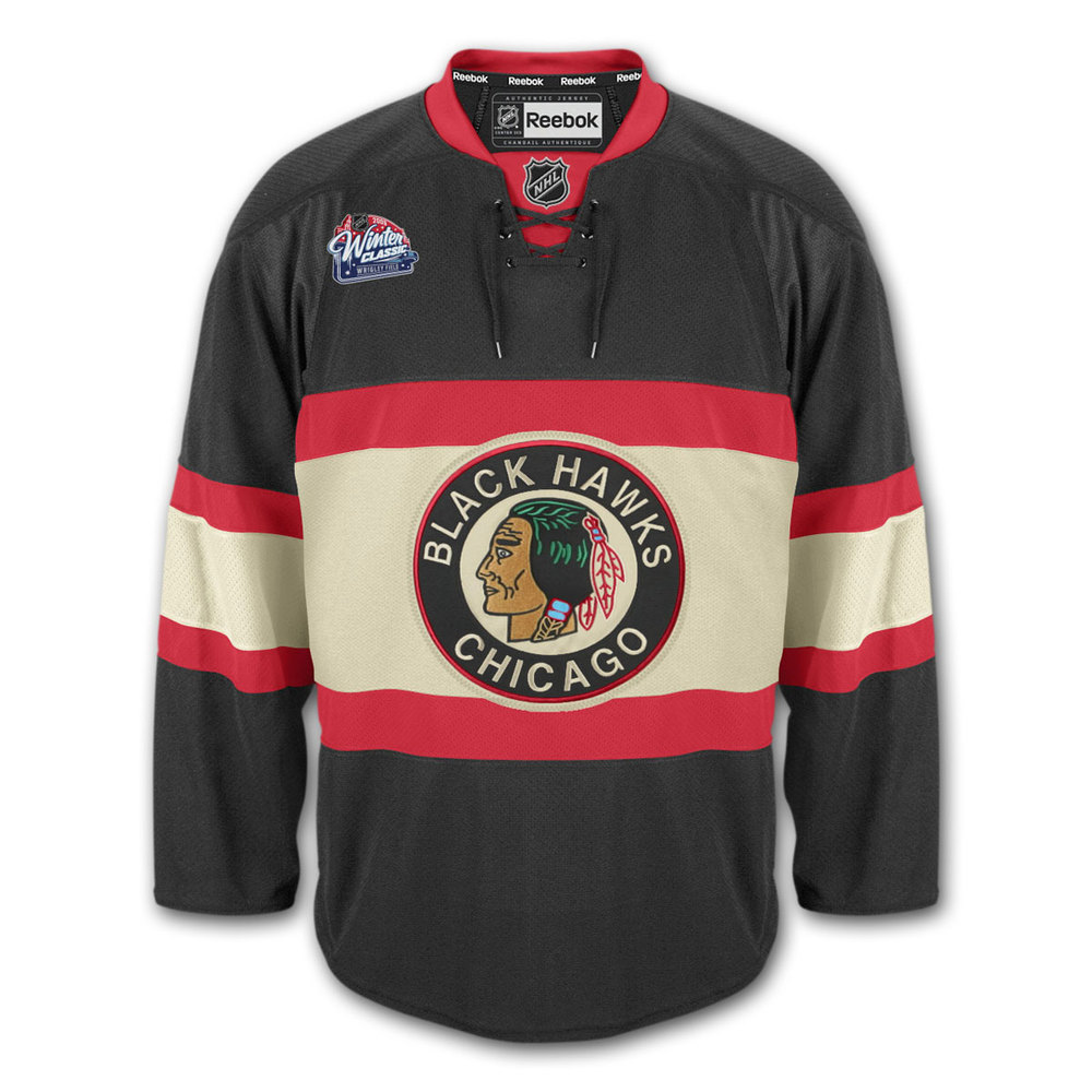
brought back for their game on New Years Day at Wrigley Field. To me, this just looks like what a hockey jersey is supposed to look like.
St. Louis Blues Third Jersey: A good classic look here for an expansion team, and you can never go wrong with blue and gold. Plus, after the first abomination they came up with as a third jersey, the Blues get props for getting it right in the end.
Quebec Nordiques Home Jersey: I just always thought this was a good looking jersey that properly captured the French Canadian aspect. I also saw these worn for one of the last times when I went to Game 2 of the 1995 EastCon Quarterfinals, the next to last home game for the Nordique before they headed for the Rockies, so it's a sentimental thing. (PS, make sure you click the link, I think you will like the pic)
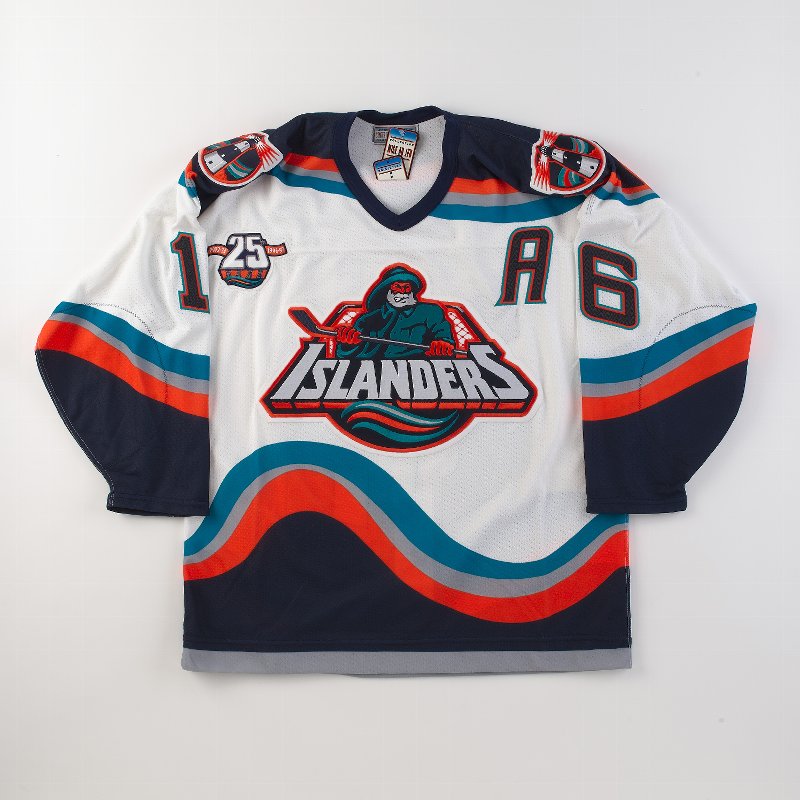
New York Islanders "Gortons" Jersey: You have to love a jersey that inspired one of the most creative hockey chants of all time. I'm also glad I never had to wear one. I wish the Islanders still wore these, wouldn't you have loved to have seen the look on John Tavares' face when he put this God-awful ugly thing on at the Draft?
Minnesota North Stars: The North Stars are on here for sentimental reasons as well. Remember back in the day those table top hockey games with the players that swiveled and slid back and forth? I had one as a kid, and the two teams that came with it were the Rangers and North Stars, so I have an affinity for those North Star jerseys. 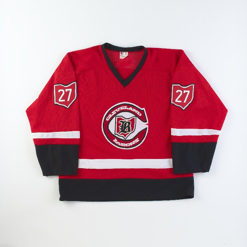
Cleveland Barons Road Jersey: Only in existence for 2 years before being merged with the North Stars, I put them on this list because no one else ever would. A good looking jersey with a cool crest.
New York Rangers Home Jersey: The classic jersey that really hasn't changed much in the Rangers 80-plus years of existence. It did some time as the road jersey, but its back in its rightful use as a "Broadway Blueshirt"
So, let me hear your thoughts, feel free to post pictures of jerseys you like in the thread.
